Manto X/S
The Manto X and Manto S are very much similar devices using what appears to be the same chipset, with only a few differences between them. The Manto X is a small, shiny, sleek, and slippery device. And while the basic shape of the Manto S is very similar, it is a bit chunkier, grippier, lighter, and comes in various water transfer skins. Both devices perform extremely similar, yet there is a clear winner in my book. But I'm getting ahead of myself. Let's jump off this review and start at the best place possible: the top.
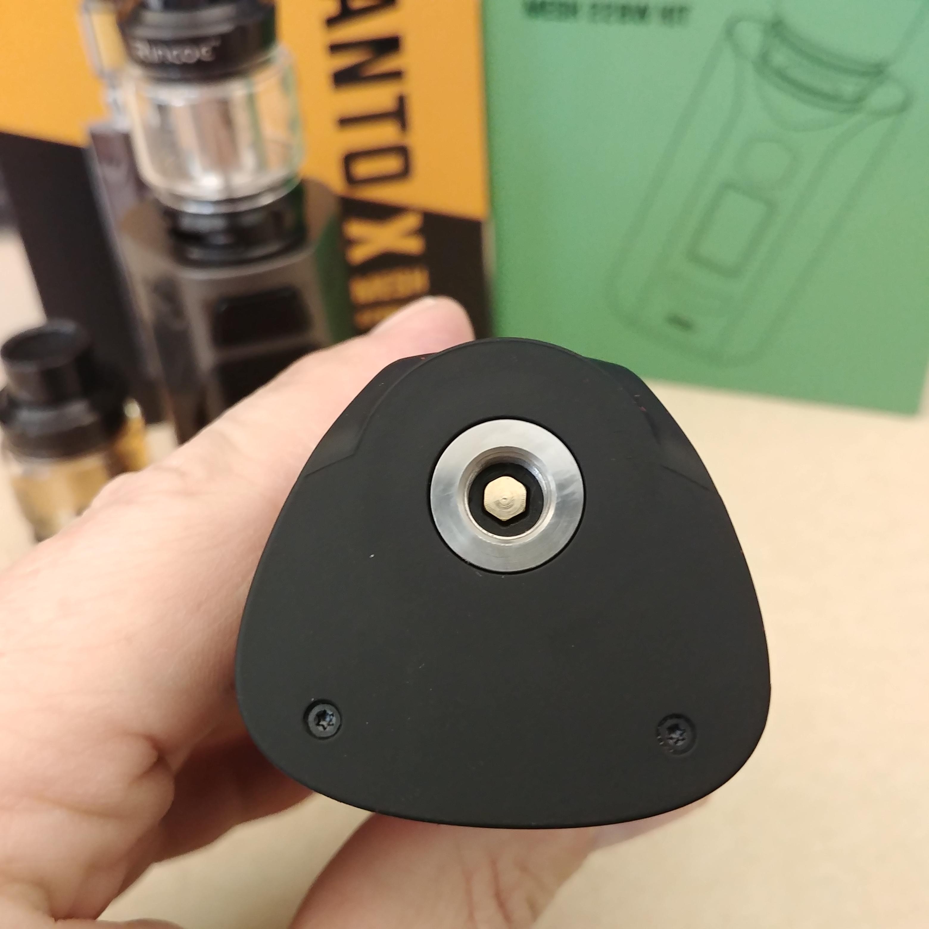
Top: The top of the Manto X has a 510 that is inserted from within the device, while the Manto S appears to be fit in from the top (not sure if it's press-fit or secured on the inside though). The X has a small circular grove on the top around the 510 for some styling and can fit up to 30mm attys.
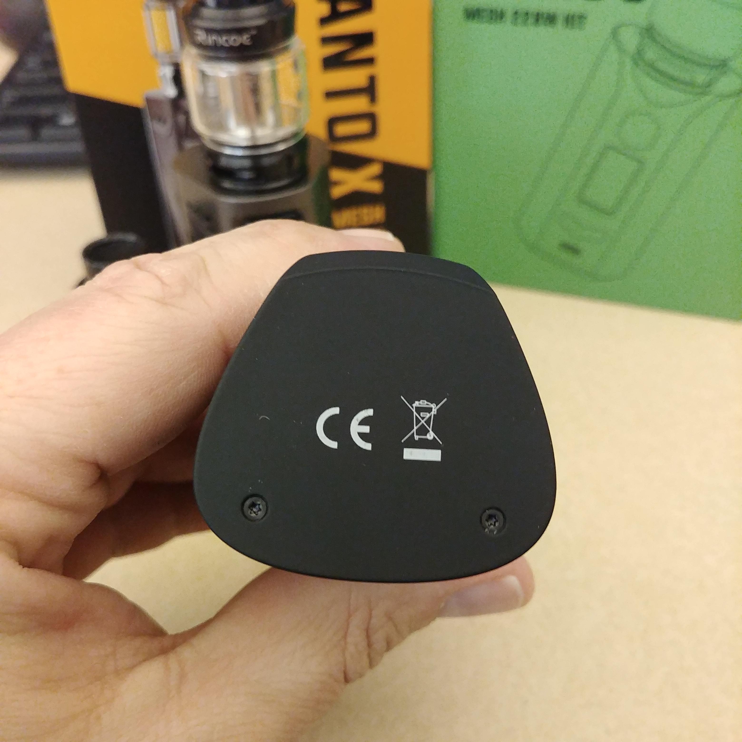
The S has a very small 510 "plate" around the connection and a few screws located toward the back to secure the battery tray. Due to a styling decision on the top-front of the device, the S can only fit 26mm attys. Both devices have nice threading for the connection and spring-loaded, gold-plated positive pins.
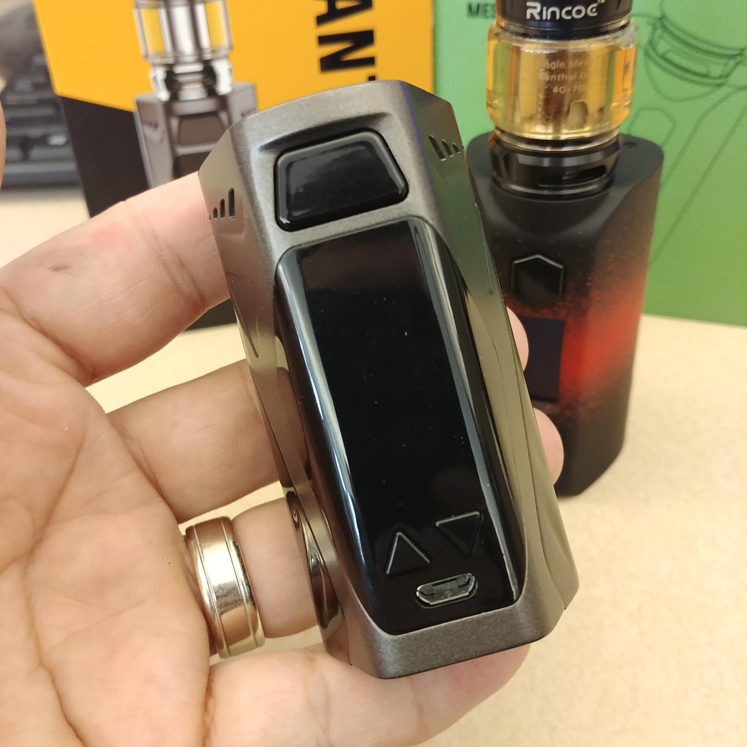
Buttons: The configuration of the front of the devices is very much identical and both have a button on the top, the screen below it, and the adjustment buttons below the screen. This is a pretty standard configuration for a lot of devices these days, so there's really nothing special here. The fire button on the X is a large trapezoid, and takes up nearly the entire width of the front of the device. I really like the size of the fire button on the X and it is slightly raised from the device making it easy to locate. The adjustment buttons on the X are triangular shaped and point in the way of the adjustment.
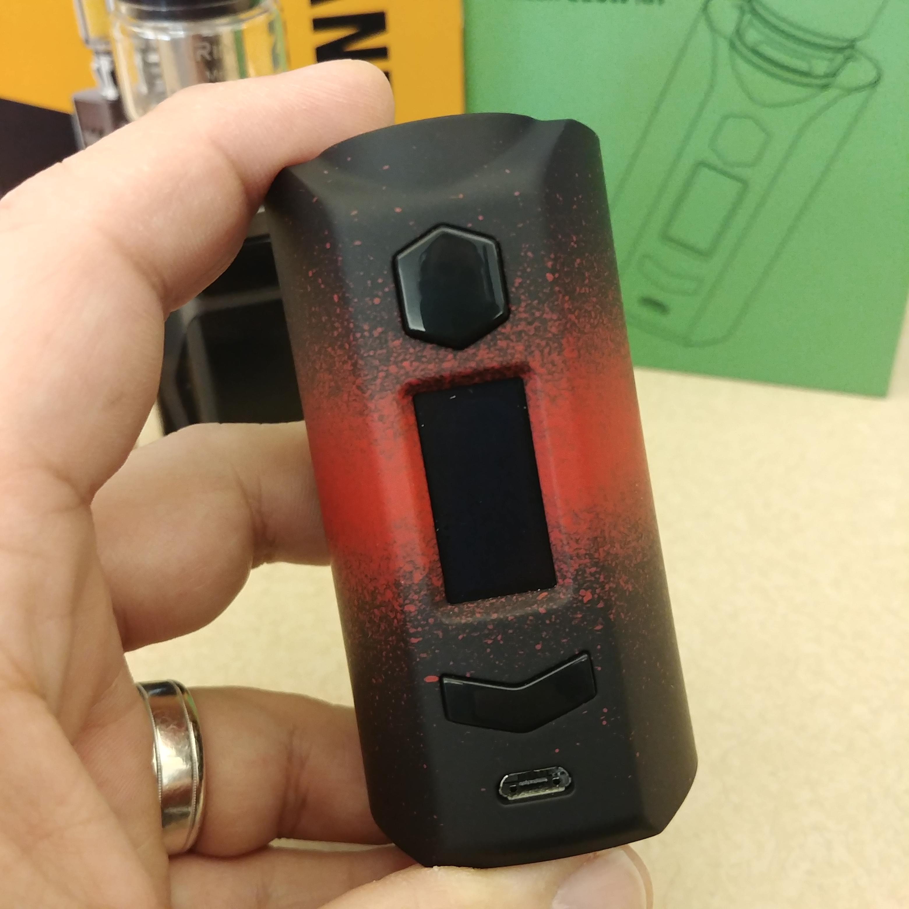
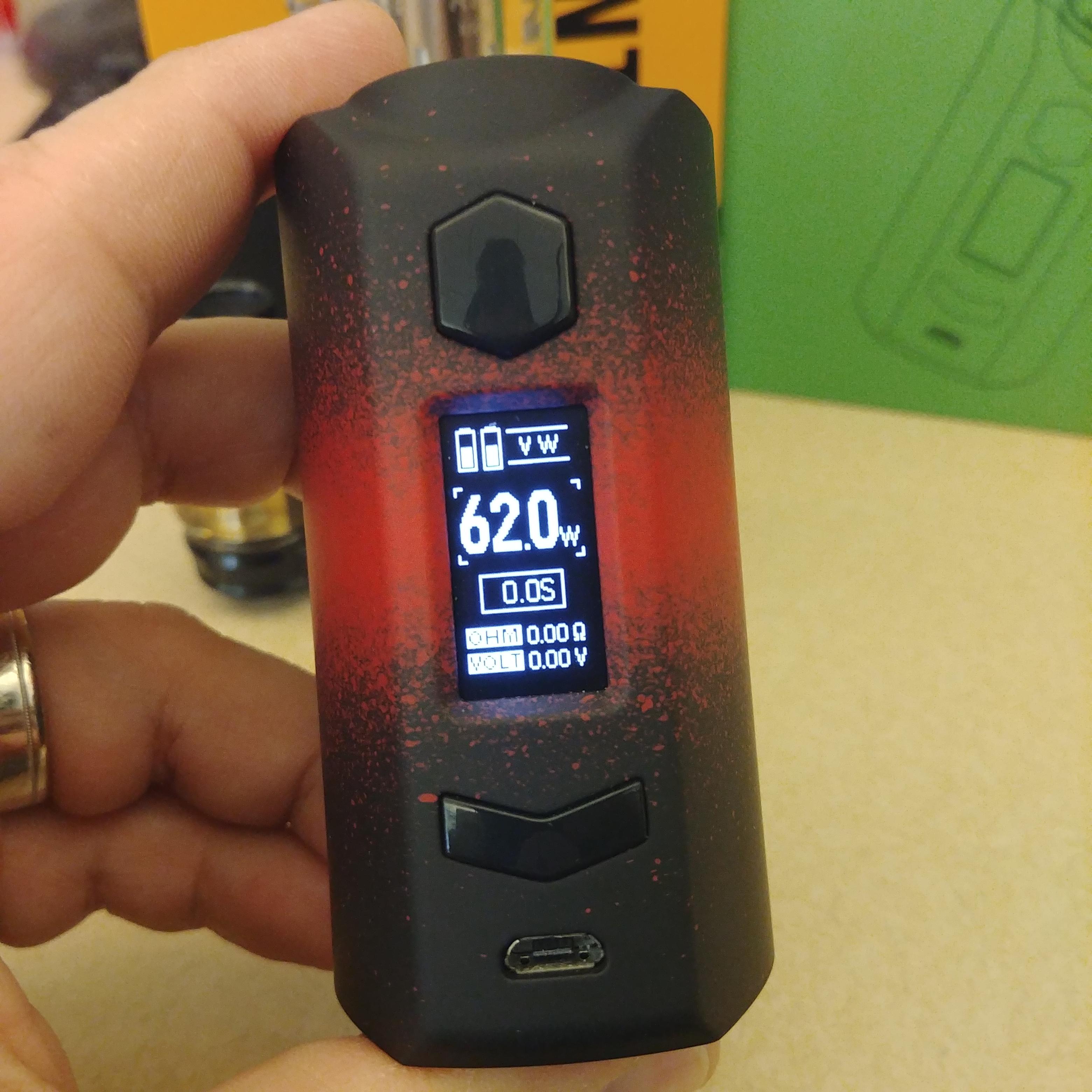
The S has a hexagonal-shaped fire button that's not nearly as large as the one on the X, but it has a more pronounced raise and is also easy to identify. The adjustment buttons are in the shape of a chevron with each adjustment located on opposite ends of it. Here is where one of the differences between the two devices is located. For whatever reason, I'm not really sure as it just seems odd to me, the adjustment buttons are opposite on the two devices: + on the left and - on the right for the X; and - on the left and + on the right for the S. Not really sure why this is the case. I figured if they're using the same chipset it would be the same configuration for the adjustment buttons, but that doesn't appear to be the case. Buttons on both devices feel pretty solid, have a nice click to them, and don't have any rattle.
Screen/Menu: The screen on both devices is exactly the same. On the top is a dual battery indicator and the mode you are in displayed beside it. Below that in much large font is your wattage/TC value. Continue moving down and you have your seconds fired, follow by your Ohms then Volts(power mode)/Wattage(TC mode). It's a real simple screen layout, but it's quite sufficient for the purpose of vaping.
There isn't really a menu system on these devices. The only real thing you can do is triple-click the fire button to enter a mode select and use the adjustment buttons to choose your desired mode. There are a few shortcuts that you can use, such as holding fire button and - while in TC/TCR mode to adjust your wattage, and holding fire button and + in TCR mode to adjust your TCR value. You can also hold down + & - to lock your adjustment buttons and still fire your device. But that's really it. There are no real display adjustments that you can made, like adjusting brightness or color or anything. It's quite the dated looking UI, but honestly, it really is sufficient enough for vaping. I'm not going to completely complain about it. I sometimes like a nice colorful screen, or a really different looking layout. But there's definitely a nice simplicity to a...well...simple UI.
The screen is another area where the two devices differ. The screen on the Manto S appears to be much bright than the one on the Manto X. I think it may be due to the lack plastic cover that is over the screen, but it really takes away from the brightness of it and I rather enjoy the screen on the S better.
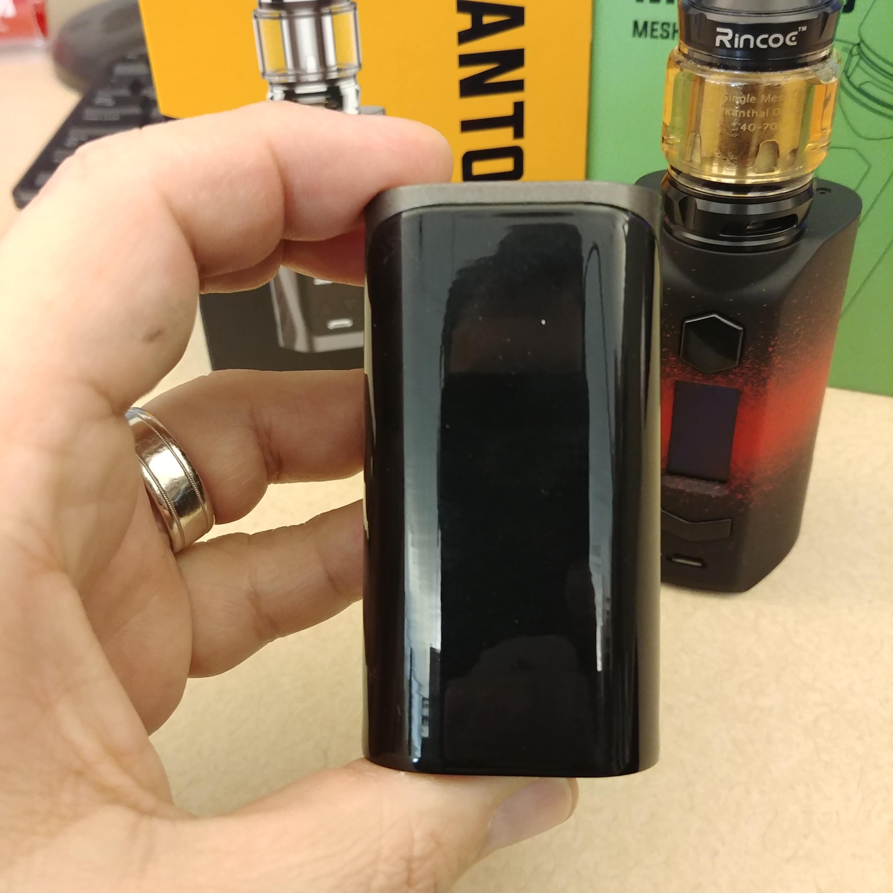
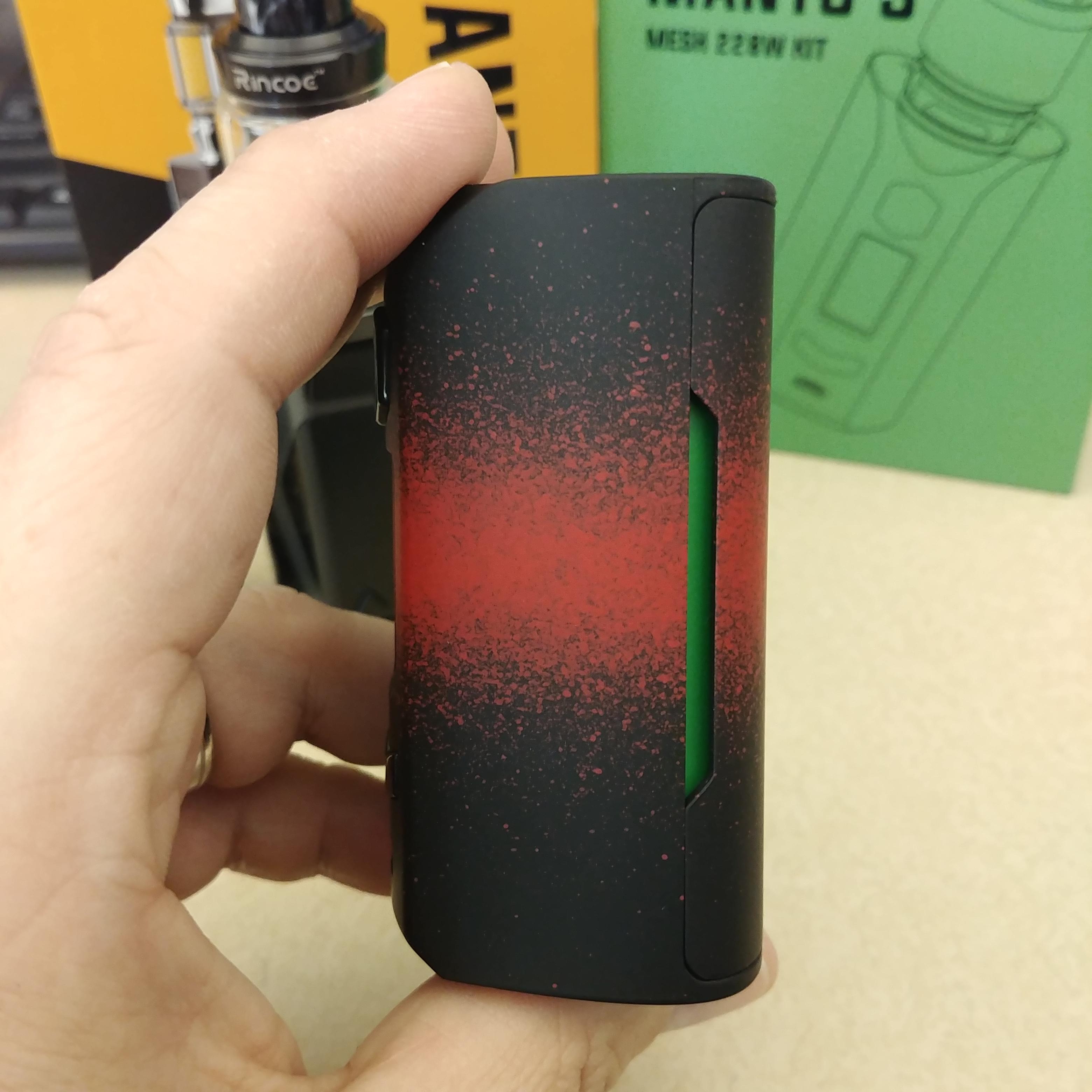
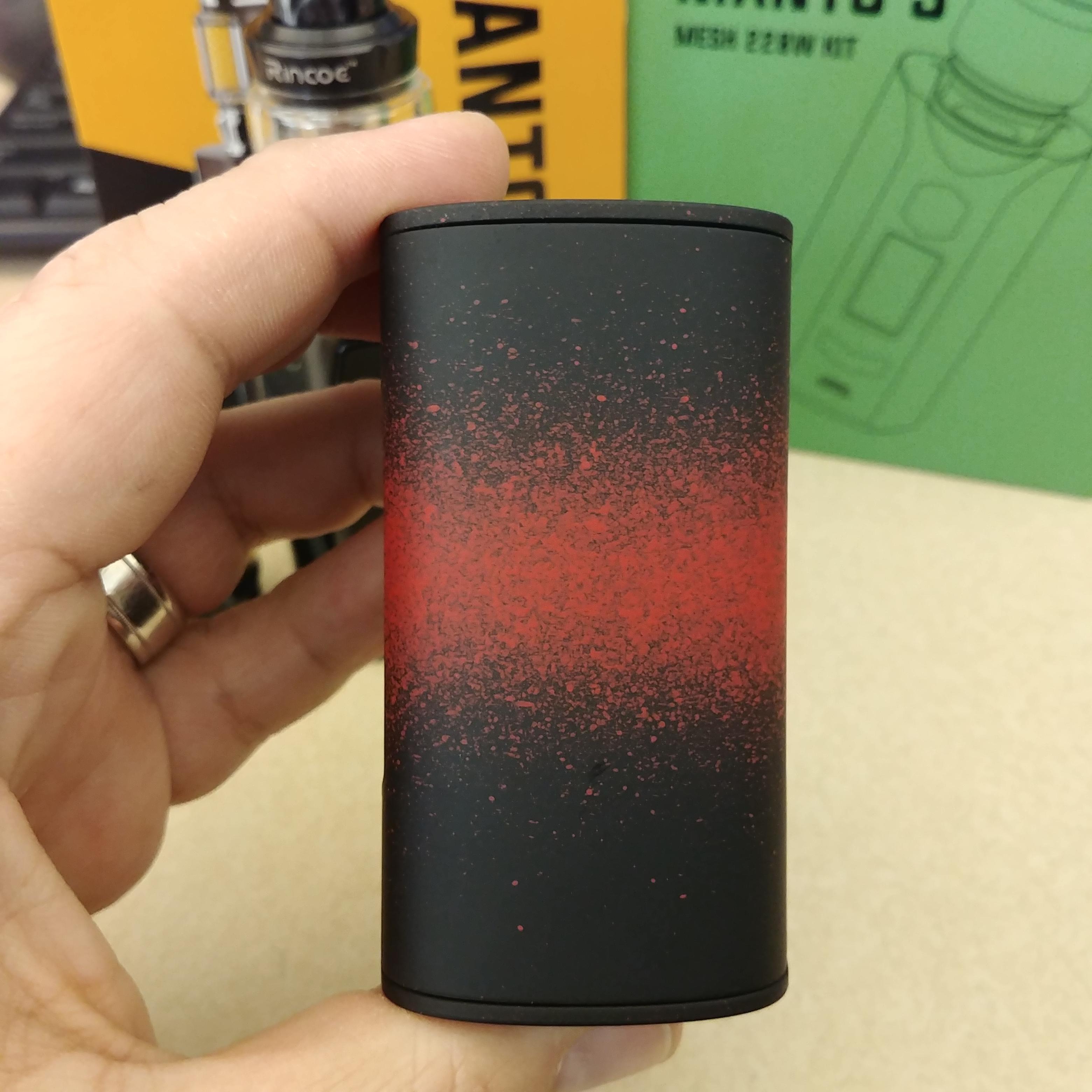
Size/Styling: The shape of both devices is a sort of rounded, 3D, trapezoid. The Manto X is a smidge smaller from top-to-bottom, side-to-side, and front-to-back, and has a more flat shape on the back compared to a small rounding found on the back of the Manto S. I really like some of the other styling decisions of the X as well as it looks like a more classy device with some nice geometric lines going through it and some darkened, polished, plastic accent pieces. The S really looks like a more bloated version of the X with a more simplistic design aesthetic. The paint on the X is smooth with a shimmering quality to it. The paint seems to hold up decently on the X except for around the 510. The first time I put the included Metis Mix tank on it and unscrewed it I already had some atty rash. It hasn't gotten much worse with use, but figured it needed to be mentioned. There's no real design elements that stand out on the Manto S other than the available skins. The finish is that rubbery plastic finish that I've seen done on many devices lately and it has patterns water-transferred on to it. I really like the grippiness of the S over the X as the X feels more prone to slipping. Other than that, the X wins in my book for design aesthetics.
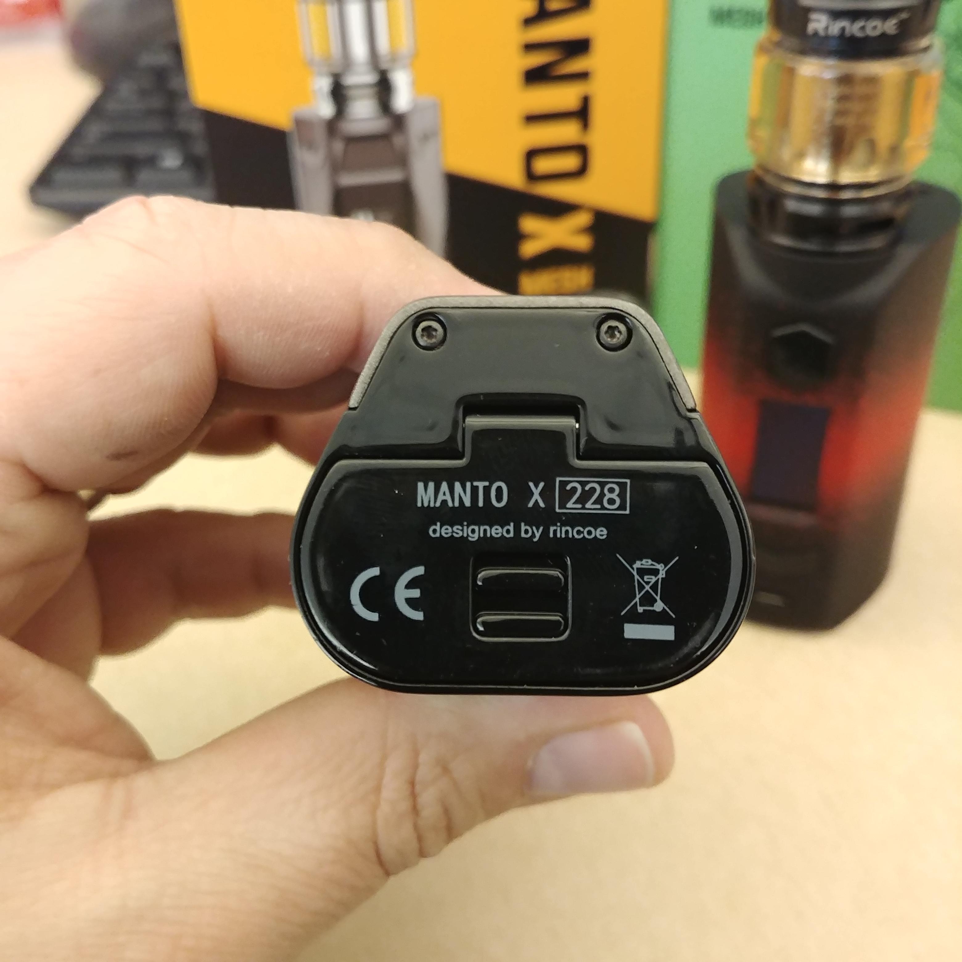
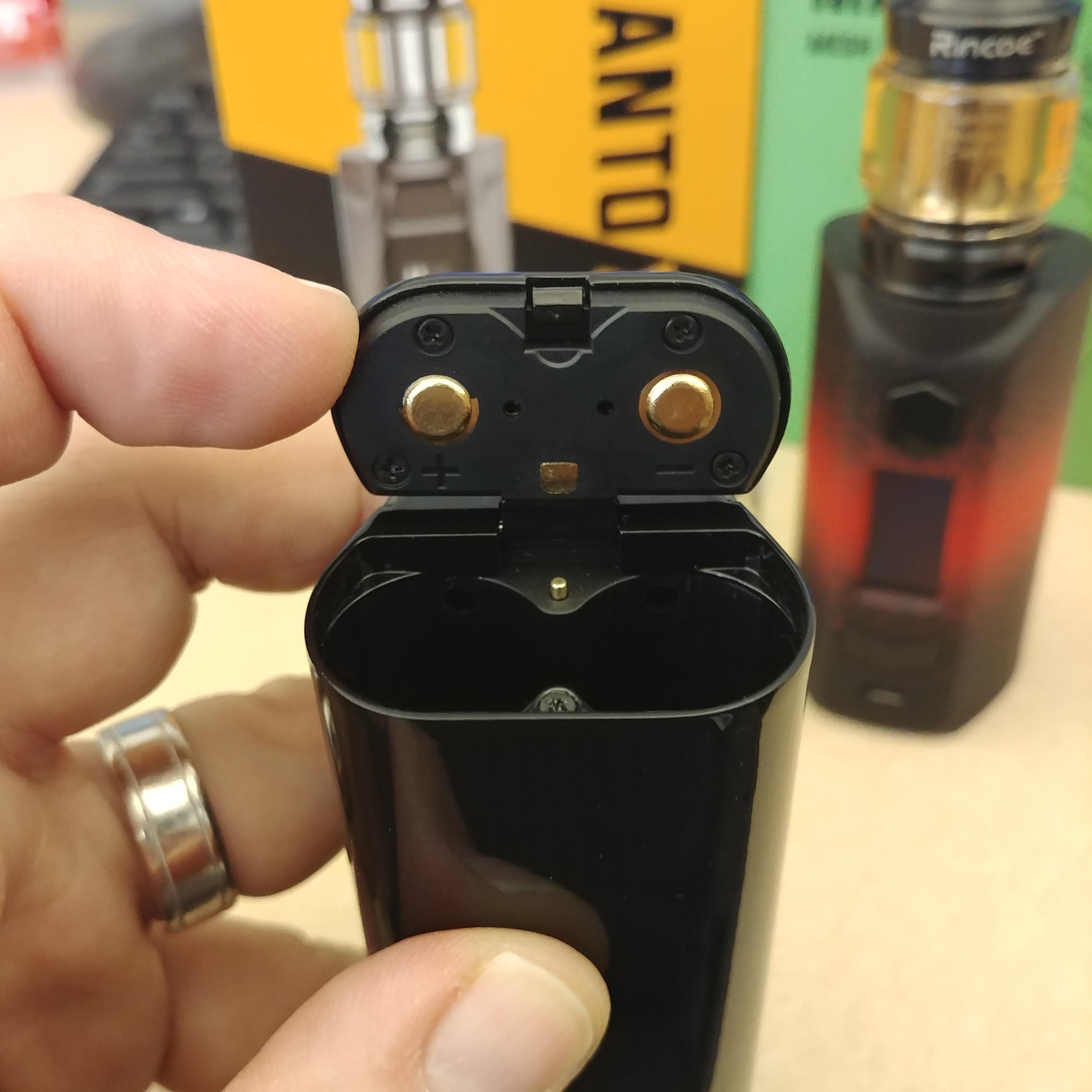
Battery Door/Tray: The main differences between the two devices is how the batteries are inserted into the device. The Manto X has a battery latch located on the bottom of the device whereas they opted for a removable back to the Manto S. The latch on the X has a really nice release button that is quite stiff and shows no signs of accidentally popping open. The latch itself is not spring loaded, but feels quite solid and latches closed very nicely. There is a bit of play back and forth with it open, but it's better than some latches I have seen. Battery orientation on the X is marked on the inside of the latch. It could have been more prominently marked on the latch, but there is white markings on the inside of the battery tray as well, so it's not a huge deal. Battery contacts are spring loaded on the inside of the battery tray.
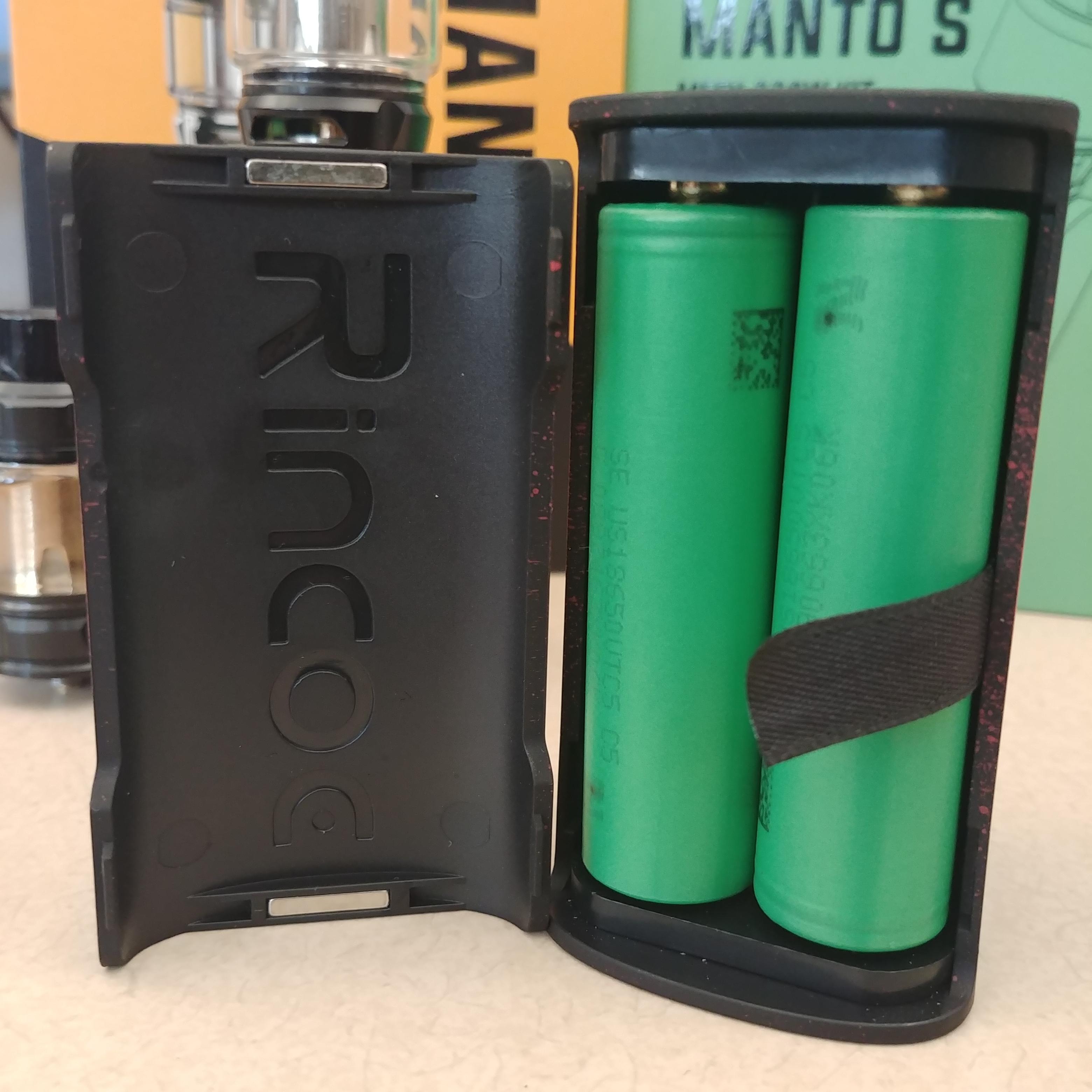
The Manto S has a removable battery door that is the entire back of the device. It is held into place via magnets at the top and bottom and has some notches along the sides that fit into groves on the device. The battery door can be attached to the device either way, however, the pattern may not line up properly if putting it on upside-down. The battery tray has very clearly marked battery orientation, a decent sized battery ribbon, and spring loaded contacts on the top.
Performance: Performance of the two devices is quite similar, as I had expected it to be. However, I did run into a slight issue while testing the Manto X that I'll get into later. Power mode performance on both devices was quite good. The both hit quickly and the power delivery felt very accurate. TC performance was also fairly good on both devices. I previously reviewed the original Manto, and I really enjoyed that device. It had really good power mode performance and I feel that it had one of the better performing TC modes of the numerous budget-friendly devices I've tested. And while both the X and S perform well, I feel the original Manto performed a bit better. That's not to say that TC is bad on the X/S. TC worked well with good power delivery and tapering and seemed to prevent dry hits well. I just feel like I enjoyed it better on the OG Manto, though.
The issue I ran into while testing the X is quite the deal breaker, though. after about 2 weeks of use, while the device was still powered on, if it went into standby mode where the screen timed-out, pressing the fire button to wake it resulted in the booth screen. This should not have happened. I contacted Rincoe about this and they explained that a few of the sample devices had a loose connection due to a poor solder job. They ensured me that this issue was resolved on the regular release version, though. However, they did not send me another device that supposedly didn't have the issue, and I can only test what I have in front of me. I did speak with another reviewer who had the same issue. They did receive a new device from Rincoe and revealed that it did not have the issue any more. I guess you can take that for what it's worth.
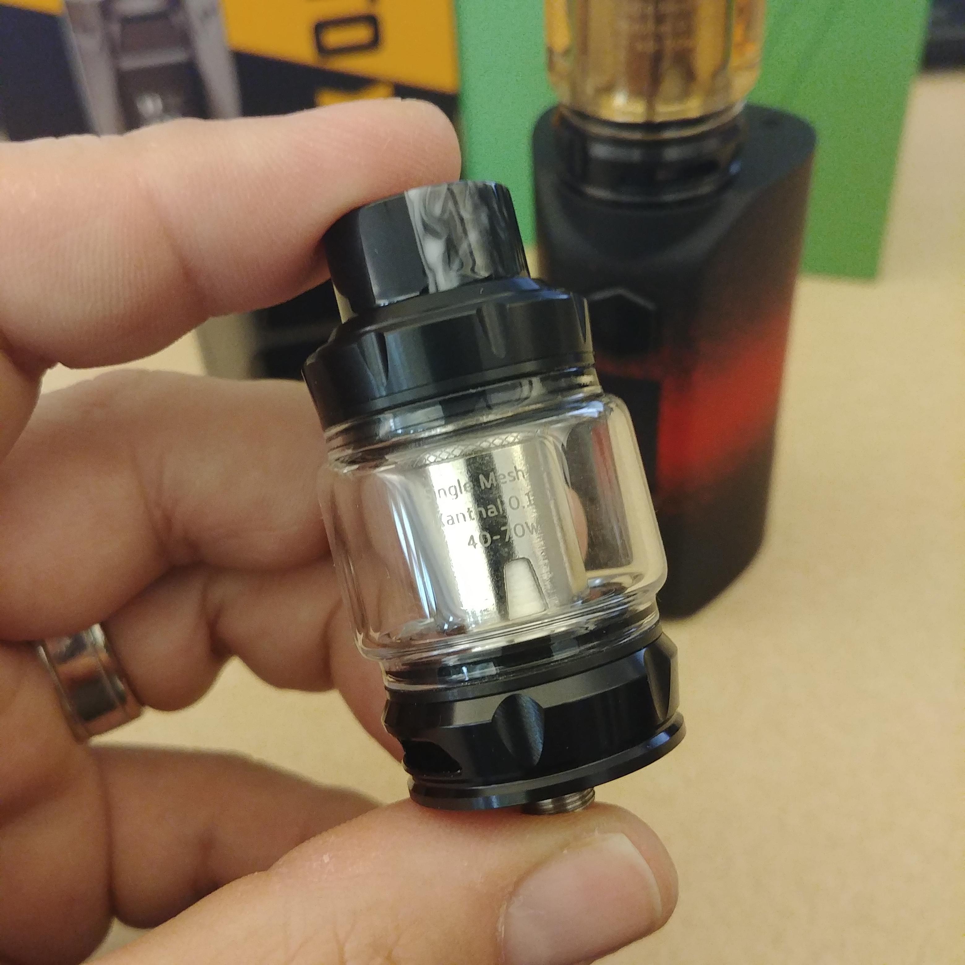
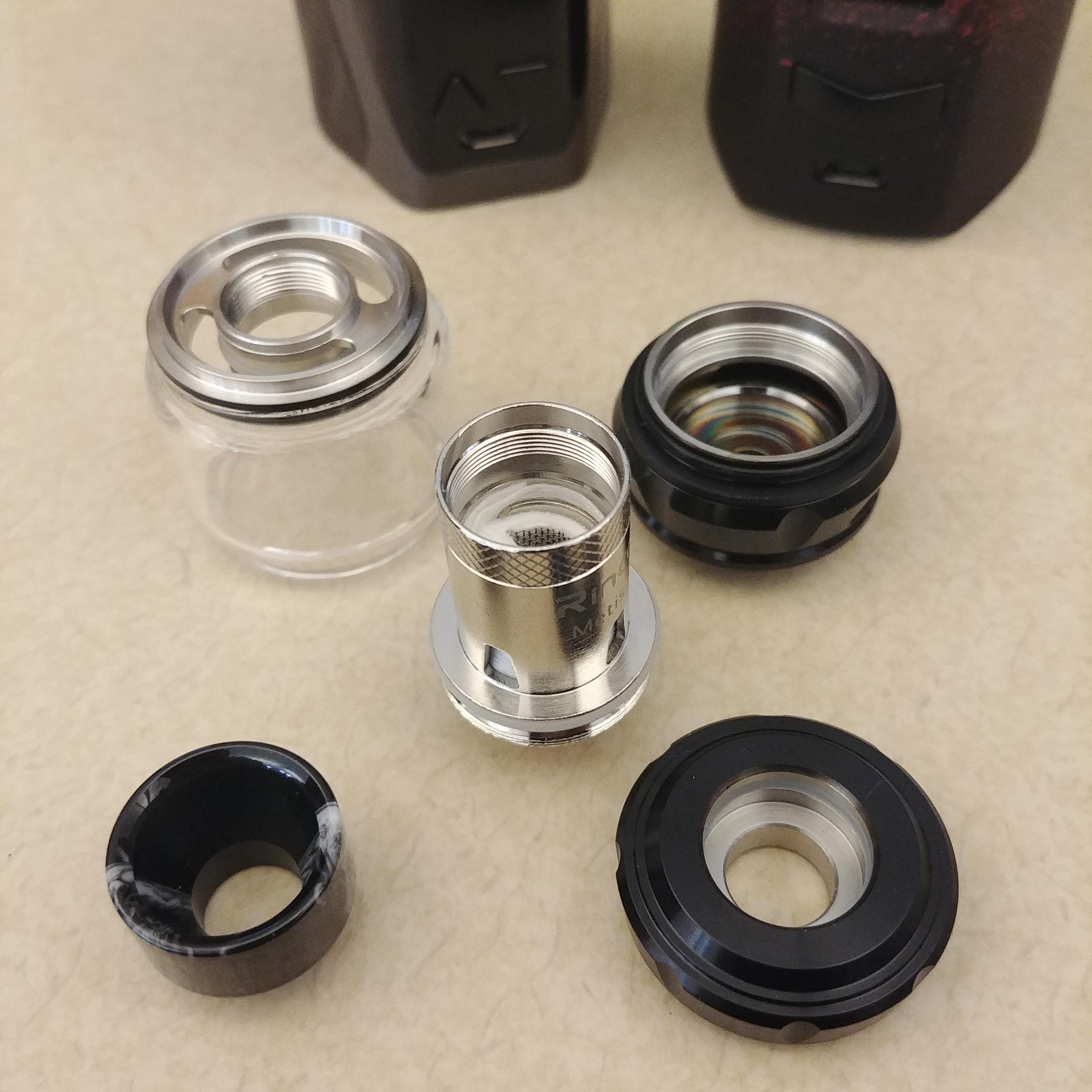
Metis Mix Tank: Both the Manto X/S kits include the latest mesh tank from Rincoe: the Metis Mix Tank. The Metis Mix is a fairly standard subohm tank that utilizes dual-adjustable bottom airflow, a screw on top cap, and utilizes an 810, resin drip tip. The tank has a multitude of available coil options ranging from single-mesh to quadruple-mesh coils, however, the kits only include 1 single mesh coil. I really would have liked to try some of the other options and feel that the kit should at least come with 2 coils as one really just isn't enough. Flavor on the single-mesh coil was decent at best. It wasn't horrible, but it didn't blow me away either. Coil life did seem to be fairly decent though, and I ran well over 60mL of juice through it before I felt like it needed to be changed. I feel like the performance of the Metis Mix tank would have been that much better had I had a dual or triple coil to use, but for what I tested, it was just okay.


