madecat_vapes
Member For 4 Years
Hello vapers! Today I am reviewing for you the VooPoo x217 mod! Originally designed as a Woody Vapes device then rebranded once the vape giant, VooPoo, acquired WV, the x217 looks to find its identity in this marketplace. Does the x217 stand as a great addition to the VooPoo line of products? Read below for my evaluation.
I have used the x217 for 2 weeks now and feel that I can give you a fair assessment of it's quality.
This device was set to me by VooPoo for the purpose of a review.
I have used the x217 for 2 weeks now and feel that I can give you a fair assessment of it's quality.
This device was set to me by VooPoo for the purpose of a review.
x217 Specs
Dimensions: 93.6mm x 49.6mm x 33mm
Output Power: 5-217W
Output Voltage Range: 0.5-7.5V
Resistance Range: 0.05-1.5ohm (Power Mode) / 0.05-3.0ohm (TC Mode)
Temperature Range: 200°-600°F / 100°-315°C
Battery Compatibility: 2(21700/20700/18650)
Screen: 1.3' TFT IPS HD color screen
Modes: Power/Voltage/TC(SS/Ni200/Ti/NC)/Custom
x217 Contents
x217 mod
USB cable
User Manual
Warranty Card
x217 mod
USB cable
User Manual
Warranty Card
Operation
5 click power button: on/off
3 click power button: cycle through modes
Hold + & -: bring up respective mode's menu
Hold fire button & +: lock buttons (cannot fire device)
5 click power button: on/off
3 click power button: cycle through modes
Hold + & -: bring up respective mode's menu
Hold fire button & +: lock buttons (cannot fire device)
Pics
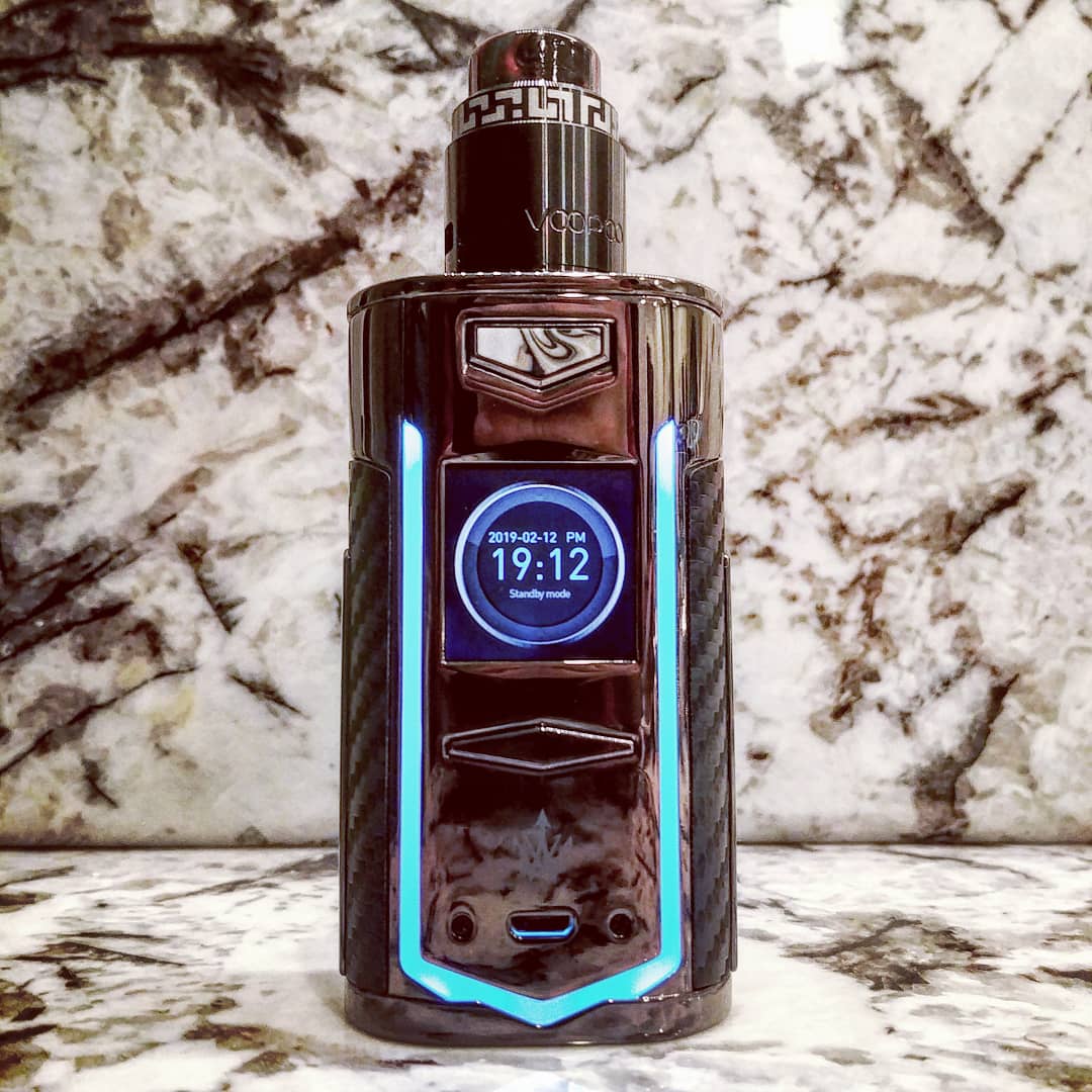
Instaglam 1
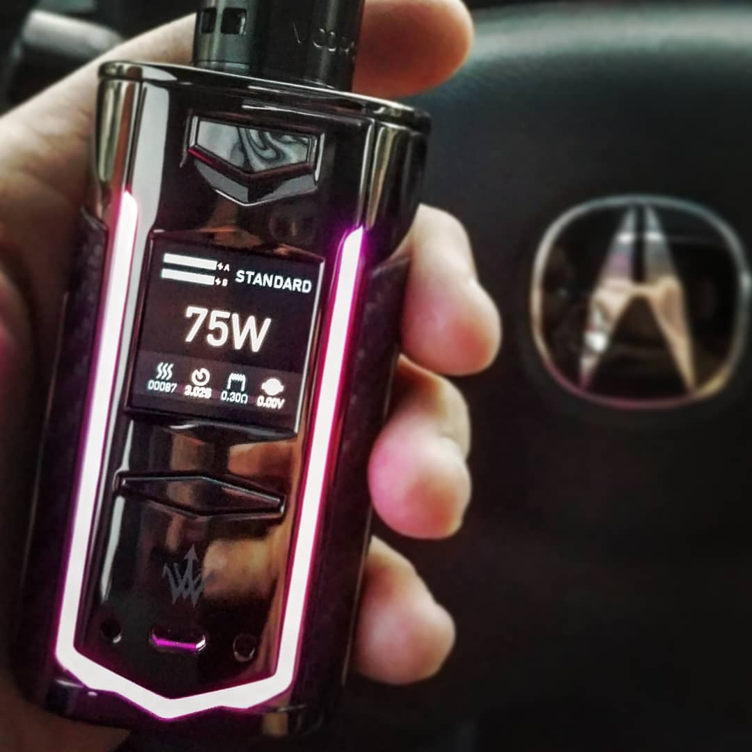
Instaglam 2
Contents

Front
Top
Back
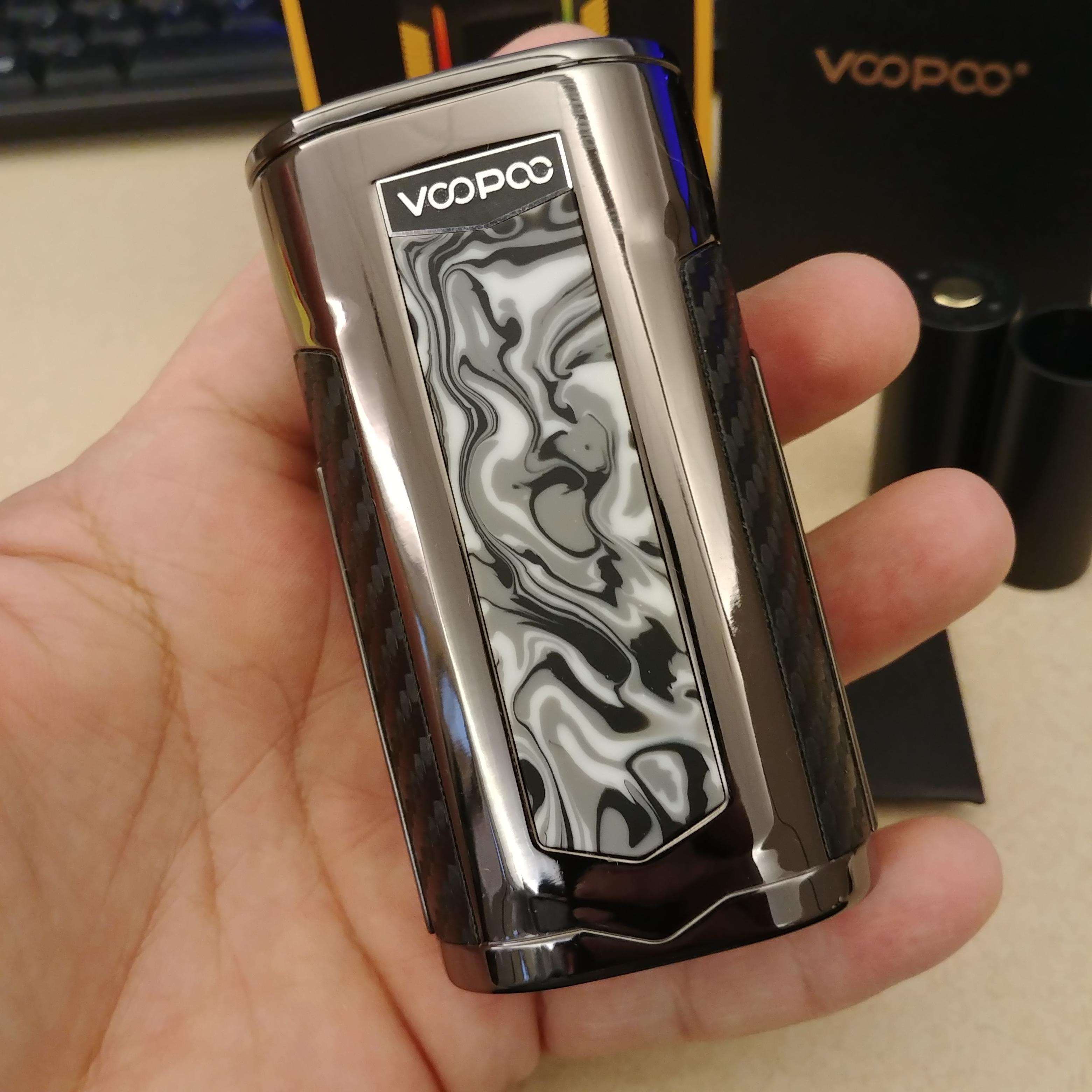
Side
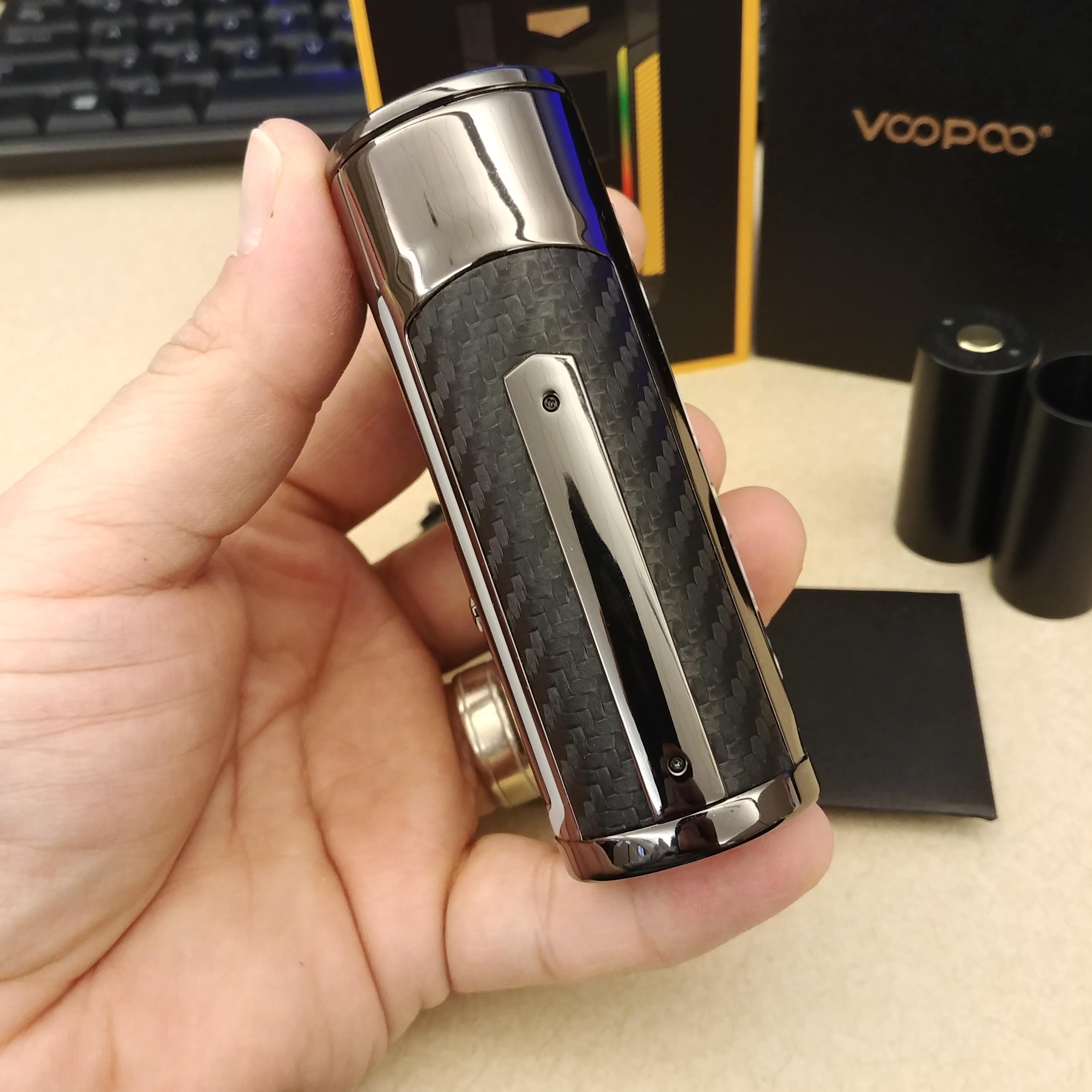
Bottom
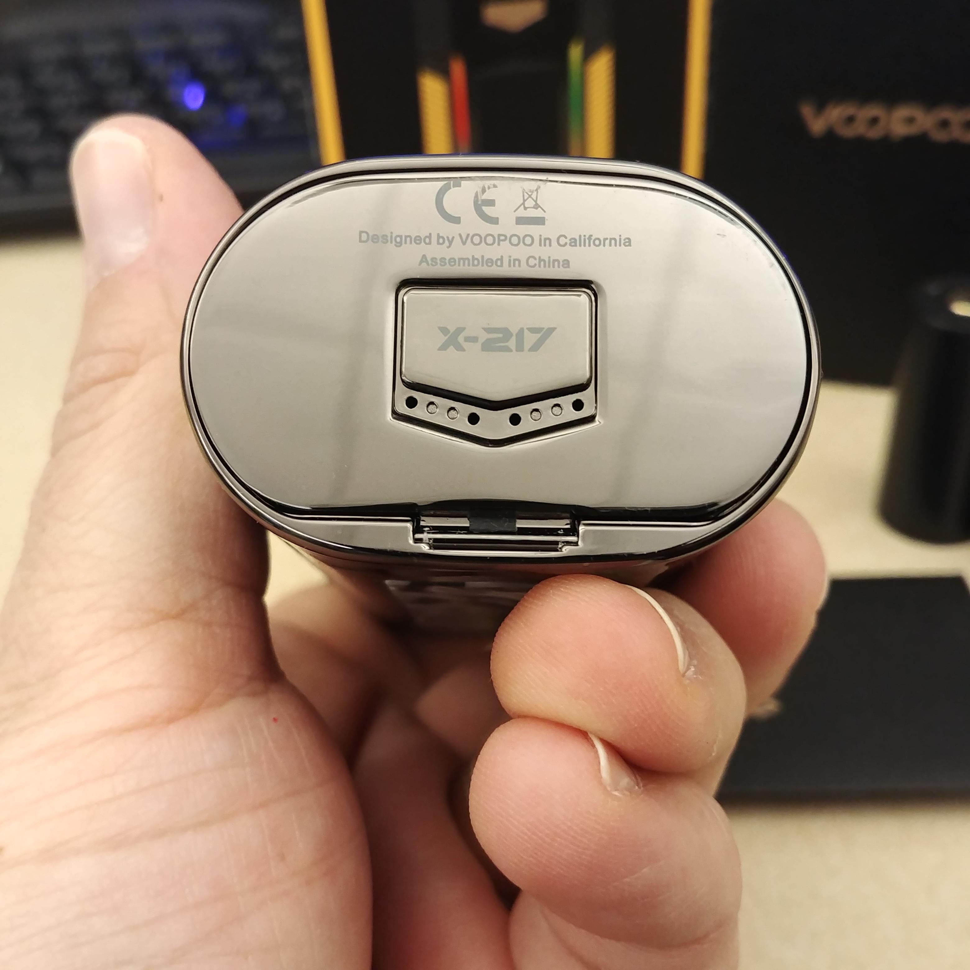
Battery Latch

Screen
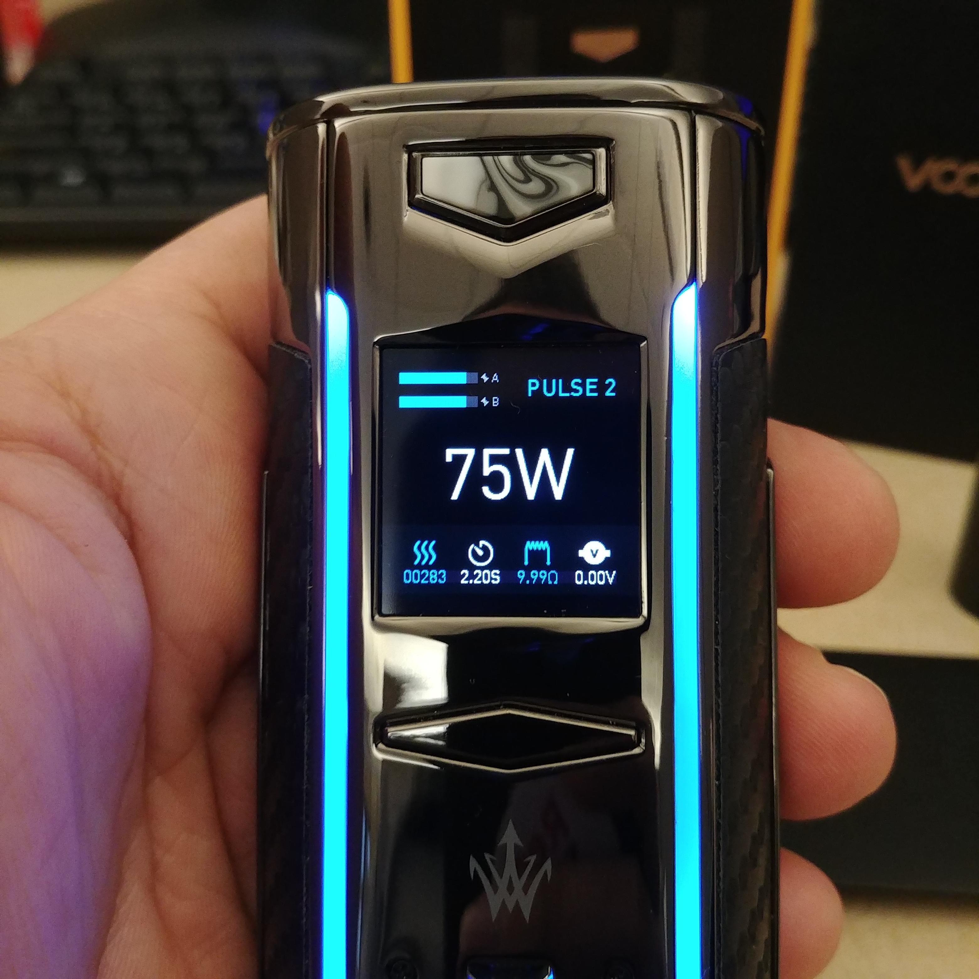
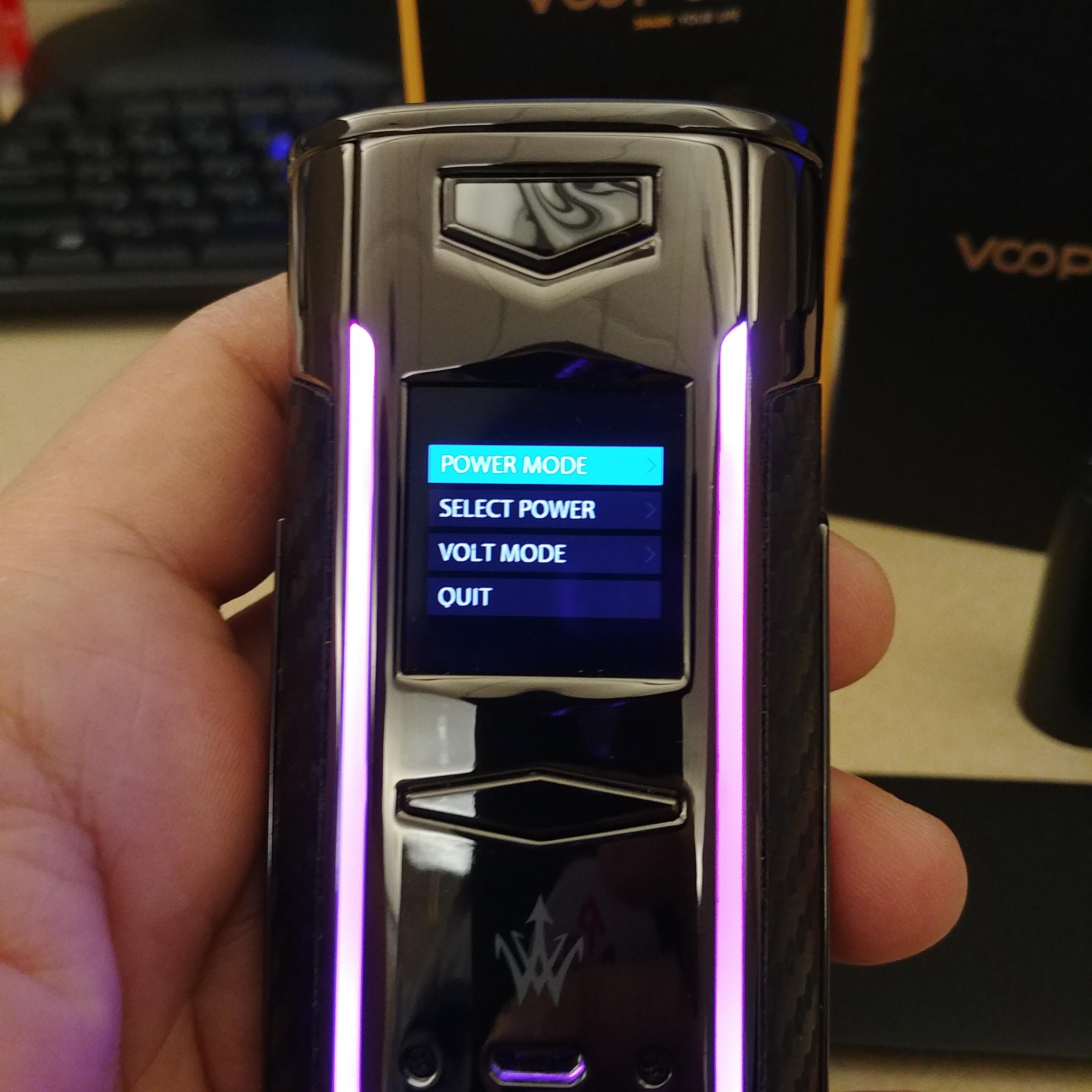
Power Menu
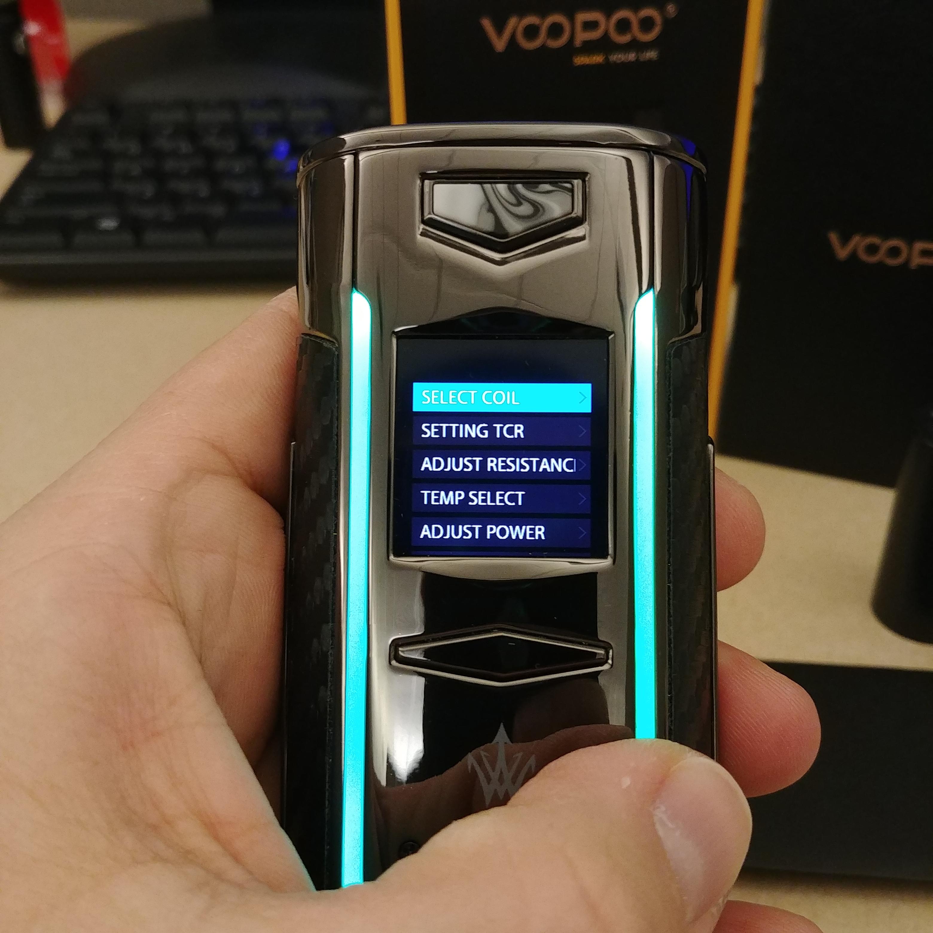
TC Menu
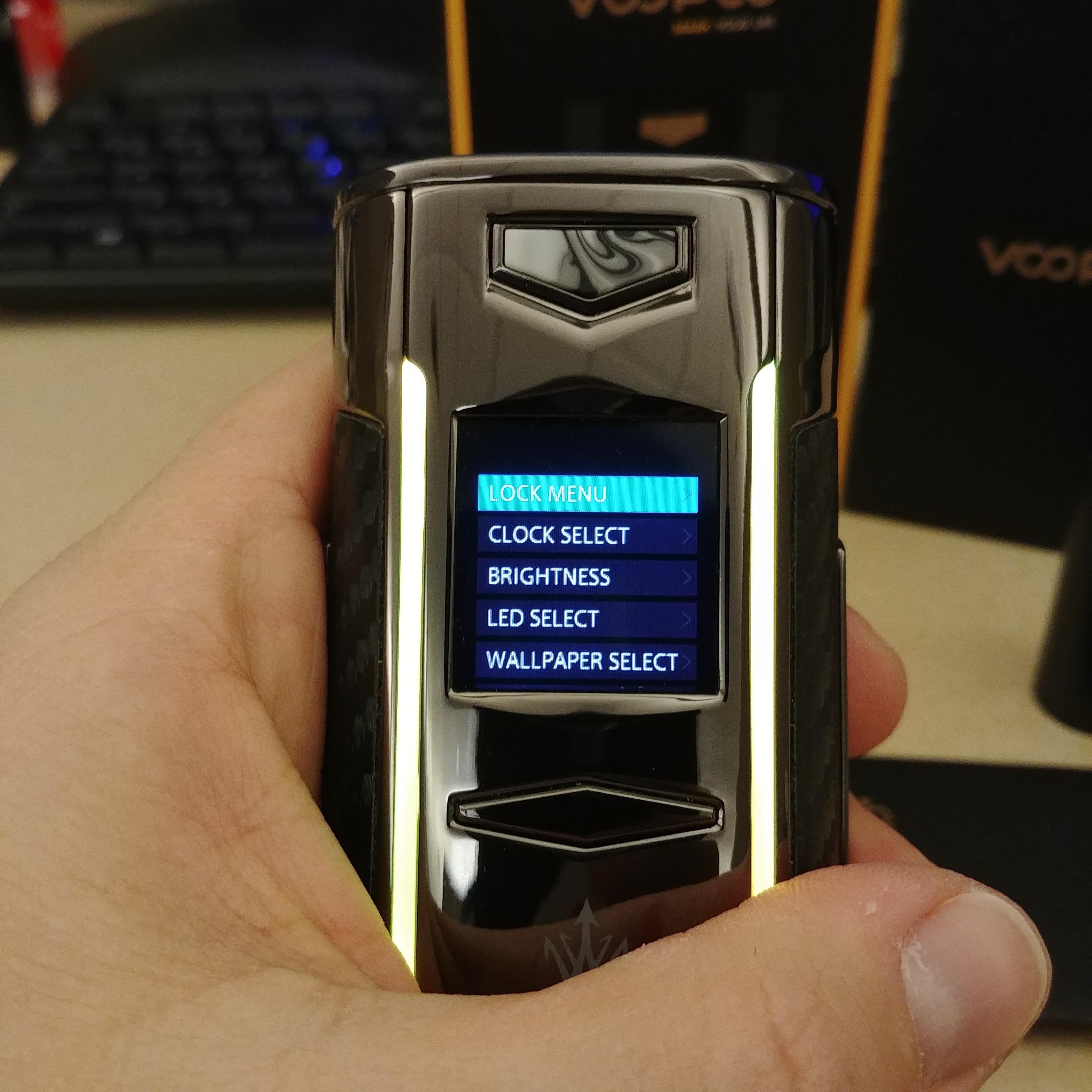
Function Menu
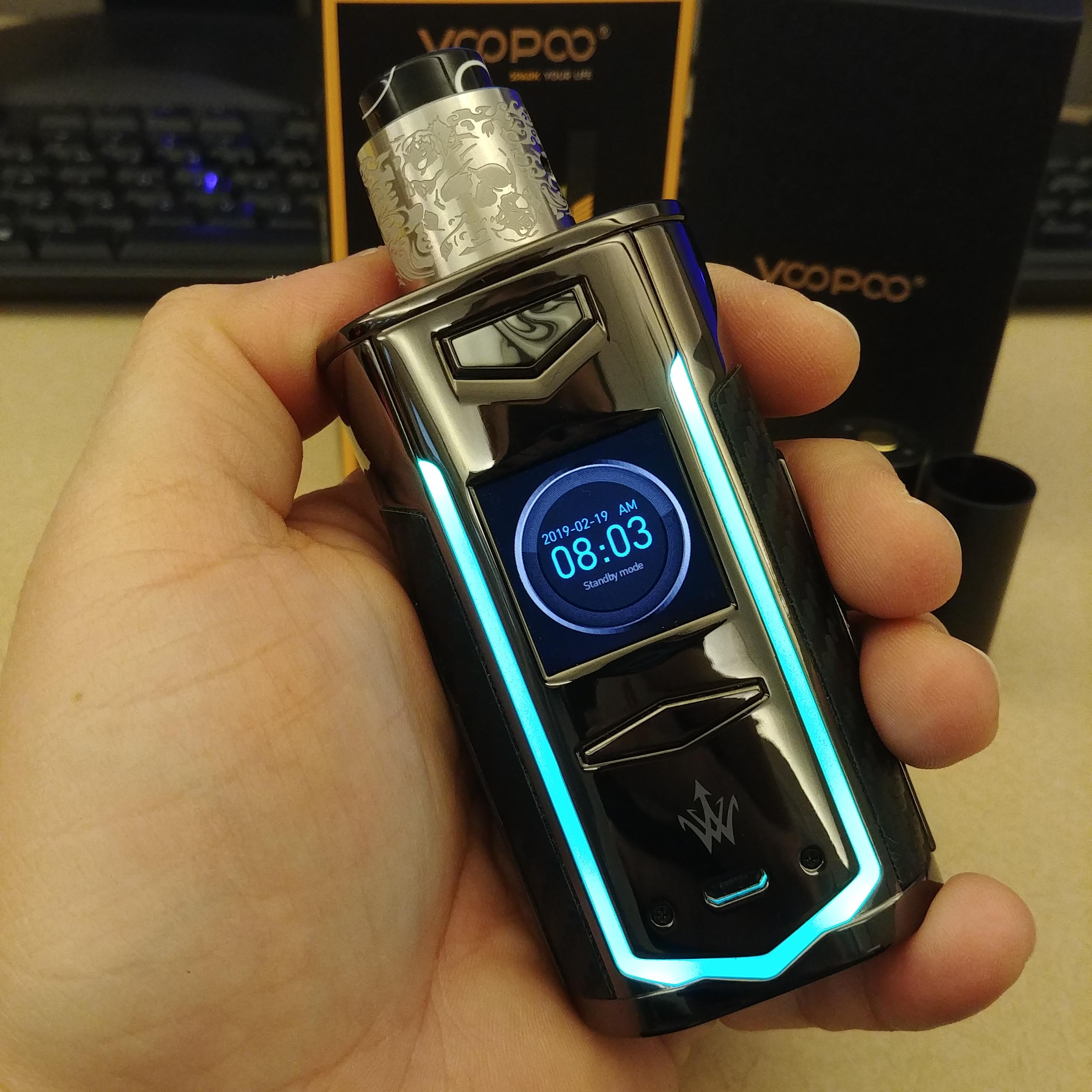
Handcheck
Instaglam 1

Instaglam 2

Contents

Front

Top

Back

Side

Bottom

Battery Latch

Screen

Power Menu

TC Menu

Function Menu

Handcheck

x217
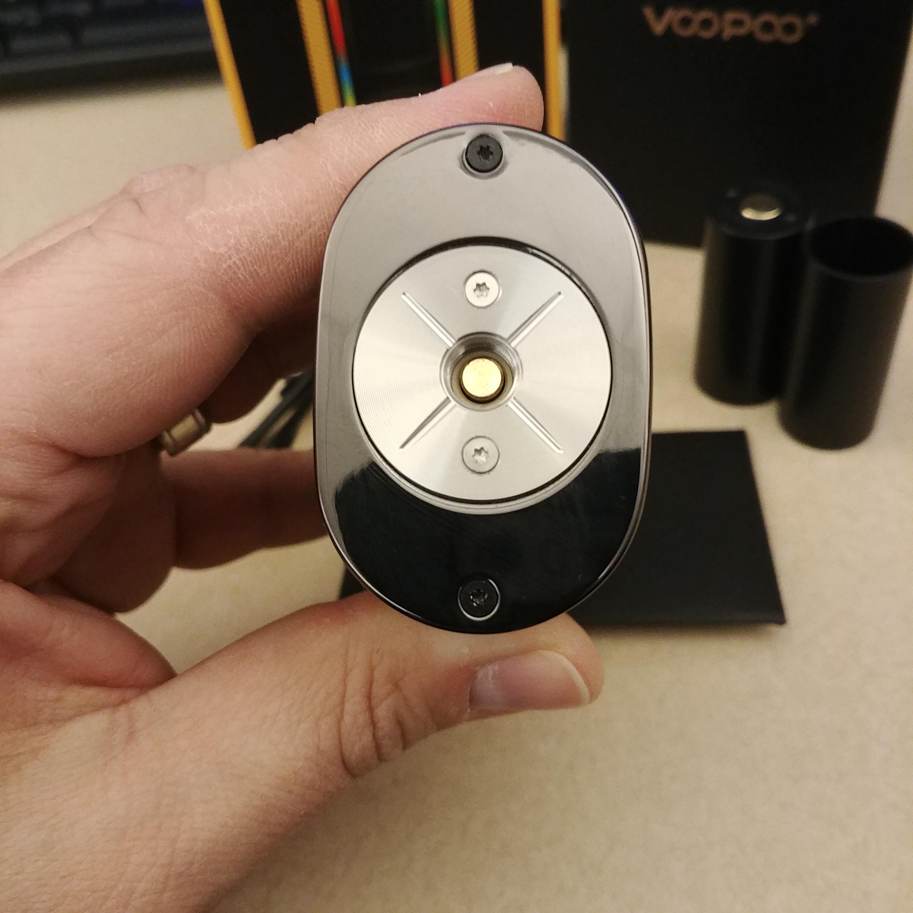
The x217 is a dual 21700/20700/18650 device which utilizes resin, carbon fiber, and zinc alloy in it's construction. The x217 was originally a Woody Vapes designed device. At some point VooPoo acquired Woody Vapes and the x217 came along with it. They are still utilizing the Woody Vapes logo on the front of the device, however, the version of the x217 no longer has the Woody Vapes name on the back of the device or the box. Regardless of how it is named, the x217 has stunning visual appeal and is a damn sexy device. But I'm getting ahead of myself. Let's jump off this review and start at the best place possible: the top.Top: The x217 has a large platform on top with a centered 510. The "plate" is large and itself can accomodate about 26-28mm attys, with plenty of space on the side for larger attys. All told, the x217 handles 30mm attys with ease and can even go a bit larger. The "plate" is held into place with two torq screws and the top of the device is secured with two more. Threading is very smooth on the x217 and the positive pin is spring loaded and gold plated.
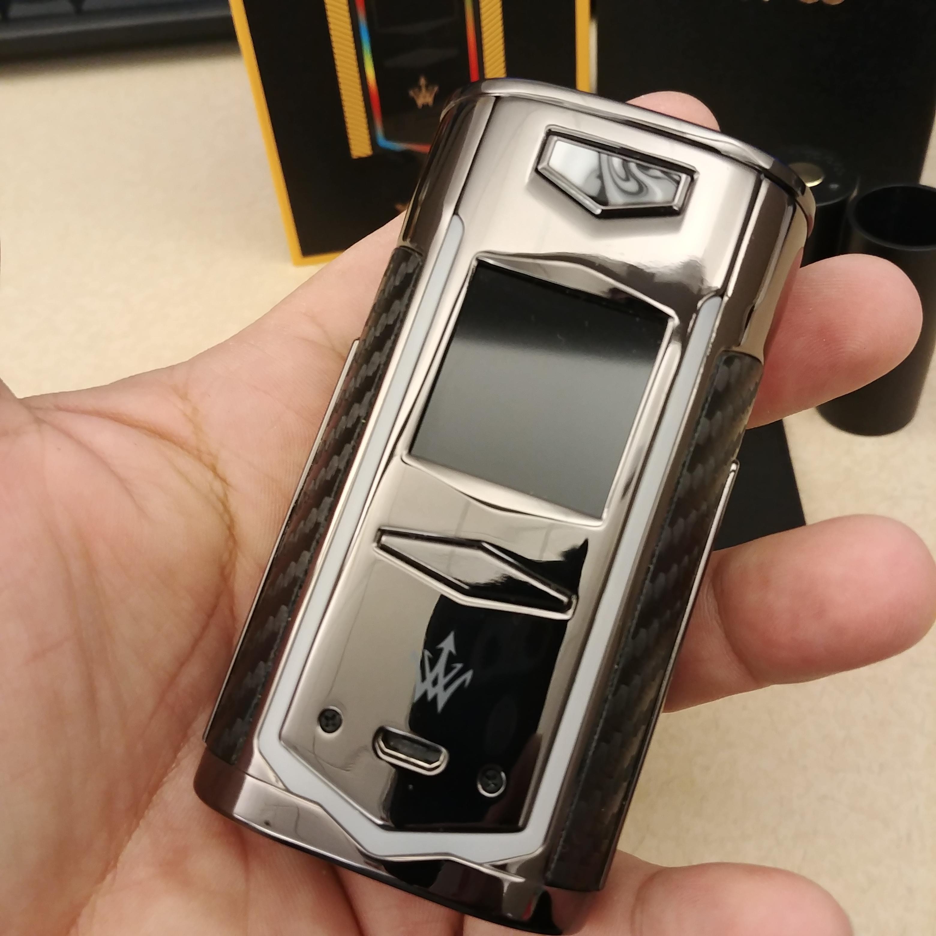
Buttons: The device utilizes the standard fire button/+&- combination that many devices do. On the front of the device towards the top is the fire button. The button is inlaid with whatever resin your version happens to be. The button itself doesn't really protrude much from the device, however, towards the bottom there is a groove that helps to set it apart. Below the screen are the +/- buttons that are combined on a rocker bar configuration. This bar is slightly raised from the device and is easily distinguishable when finger-feeling your way to it. All buttons have a nice click to them and don't feel squishy at all.
Screen/Menu: The screen on the x217 is a beautiful color screen with nice resolution and capable of displaying wallpapers. It is a welcome update from many of the older-style screens found on VooPoo devices. The screen displays dual battery indicators, your mode, watts/voltage/TC (depending on your mode), puffs, a persistant puff seconds, resistance, and volts/watts (depending on your mode). There are a few things here I really like. The dual battery indicator is really nice. I wish there was some percentage indicator or corresponding number as well, but just having the dual indicator is a nice thing. Also, the puff seconds persisting until your next hit is something more companies need to do. I don't see the point in having a seconds counter if I cannot view those seconds after I take a hit.
Navigating the menu is quite easy. You triple click the fire button to switch modes and each mode has it's own menu. While you are in a mode, hold down + and - for a few seconds to display that mode's menu system. From there, you can adjust certain things associated with that mode. For instance, the Power mode menu lets you select the Power mode (Standard/Pulse 1/Pulse 2), setup your Power Curves, and switch to Voltage mode. The TC menu let's you choose your coil material, adjust TCR, adjust TC wattage, set up your TC Curves, etc. The last "mode" is Function and is really just a device settings menu with such adjustments as clock select (how long your timeout screen displays), brightness, LED select, wallpaper select, language, time, and date options. The menu system is really quite intuitive. There are a few things that bug me about it though. It's quite difficult to enter the menu without adjusting your wattage/voltage/temp so I end up having to adjust it back when I come out. Not a huge deal, though. Power Curve mode displays as "CRUVE" on the screen. Again, not a huge deal, but it's just sloppy and on a device that looks as good as this one, I expect more. In TC mode, I really wish there was a shortcut to adjust the wattage rather than entering the menu and adjusting it there. There is currently no functionality for holding down the fire button and -, so it could have been implemented there. These really aren't huge deals, just personal opinions and preference.
Battery Door/Tray: The button of the battery door is sleek and matches the rest of the aesthetics of the device. There are some battery venting holes below the door button, which is good to see. The button is very easy to slide open without having to pry a finger nail in there to force it open. The door is nice and springy. The door has very minimal movement to it when it is open and is done very well. Battery contacts on the inside of the device are spring loaded and the battery orientation is clearly marked on the door. I have a few issues with the battery door/tray. When closing the door, it's a bit squishy and doesn't have a click or any sort of feedback to let me know it's definitely closed. However, it does stay closed securely so you don't have to worry about your batteries accidentally dumping out. One more thing, I did notice some slight battery rattle when giving it a good shaking. You're not likely going to be shaking it like I was, though, so you'll likely never notice it.
Size/Styling: For a dual 21700 device, the x217 is a fantastic size. I didn't do an actual comparison, but just looking at it, it seems to be about the size of the Smoant Cylon and probably very similar in size to a G-Class, maybe a touch larger but not by much. It's really the perfect size for me and I feel like this is probably the smallest you can get a dual 21700 device. The x217 itself isn't incredibly hefty, and while it does take on a bit of weight with two 21700 batteries in it, it doesn't feel overly heavy.
The styling of the device was the main draw for me when I first saw it announced. It really screams elegance to me. The combination of the polished finish, carbon fiber accents, and resin inlays looks supurb. The LED strip on the front might not be everyone's cup-o-tea, and if that's the case you do have the option of turning it off, but I think it makes the device pop that much more. You would think the polished metal bits on it would be a fingerprint magnet, however, fingerprints aren't terribly noticeable. I'm not sure if it's the color that I have, but I only really notice them if I'm studying the device trying to find them. I don't really have anything negative to say about the styling, but if you want me to get nit-picky again, I will say that I noticed one side of the LEDs changes colors a little bit differently than the other and isn't always uniform. It's probably not something everyone is going to notice, but I did and figured I would mention it.
Performance: So, the device looks amazing, but performance is where it really counts, and while performance is mostly good on the x217, there is some room for improvement. In Standard Power mode, the x217 has a bit of a delay that was noticeable to me. I figured maybe it was a preheat option that could be changed, but it wasn't. However, Power mode has two other Power options: Pulse 1 and Pulse 2. These two options presumably pulse power while you are taking a hit. While I didn't really notice much pulsing going on with these modes, they did seem to hit much better than Standard mode and I have stuck with using one of these modes. Delay is not noticeable in pulse mode and they really just feel like higher preheat settings to me. As for TC mode, I don't think the x217 does such a great job. The default TCR value for SS hits really weak even at 580°F. Even when increasing the TCR it didn't do much to improve the overall experience. I'm not sure whether the wattage has something to do with it, but the x217 suffers from the 80W limitation that all other VooPoo devices does. For TC, the x217 just didn't do it for me.
